
Dental sites either ignore structured data or spray every schema.org type they found in a plugin. Neither helps. The useful set is small: a DentalClinic / LocalBusiness record that matches the Google profile, Article markup on guides, and FAQPage only where you asked a question a human would actually type.
Name, address, geo, opening hours, telephone, URL, and the same medical speciality you claim on the site. If you have two locations, do not emit one mashed clinic. If you are not taking NHS patients, do not let a leftover MedicalClinic template say otherwise. Invalid or contradictory schema is worse than none because it teaches the search engine not to trust you.
Good dental FAQs are operational: “Do you see children on the NHS?”, “How long is an implant assessment?”, “Is parking at the back?”, “Do you offer 0% finance on treatment plans?”, “What should I do if I have swelling at the weekend?”. Bad FAQs are twelve ways of saying you are gentle and modern. Google has been picky about FAQ rich results; write them for the patient first. If a rich result appears, that is a bonus.
Put the answers on the relevant treatment or contact page, not only on a dumping-ground /faq/ that nobody links. Markup the questions that are visible. Do not hide a second set of schema questions the visitor cannot see.
Journal posts and ranking guides should emit Article with a real author, a date, and the publisher you actually are. Do not mark up agency reviews you did not collect. Do not invent aggregate ratings. The GDC and the search engine are oddly aligned here: do not dress advertising as a clinical fact.
When hours change, change the schema. When a clinician leaves, change the page and the markup. Validate with a rich-results test after theme updates. Schema is not a launch task. It is the machine echo of the same facts you already owe the person in the car park.
Schema that still lists a retired associate as the only dentist is worse than no schema. Same for a phone number you ported last year. Tie the JSON-LD to the same fields you edit for the footer and the Google profile. If a developer hard-coded the graph in the theme, move it to a place a practice manager can change, or accept that it will be wrong by Easter. Wrong structured data is a confident lie to a machine.
Do not mark up opening hours that include a lunch close if the Google profile says you are open. The two graphs will fight, and Maps usually wins. The website’s job is to agree.
If the questions are sales copy, “Why are we the leading cosmetic dentist in the county?”, do not mark them up. If you have one genuine question, one FAQ node is enough. If you change an answer, change the markup the same day. And if Google stops rewarding FAQ rich results tomorrow, you still have a page a human can use. That is the test. Schema is a translation layer. It cannot invent a practice that answers the phone.
For most UK practices the useful graph is: the clinic, the main pages as WebPage, Article on anything editorial, BreadcrumbList if the theme can keep it true, and FAQ on the handful of operational questions. Skip JobPosting unless you are hiring. Skip Event unless you are really running an evening. Skip the twenty extra types a Yoast-style panel will tick if you let it. Every extra type is another thing to keep honest when the practice changes.
Re-validate after a redesign. Theme switches silently drop or duplicate graphs. A duplicate LocalBusiness with last year’s phone is a common leftover. Search Console will not always shout. A patient who calls the old number will.
When you publish a new journal piece, emit Article and stop. Do not also mark it as a MedicalWebPage with invented contraindications. Editorial is editorial. Clinical advice belongs on a page a dentist has signed, with a date. Mixing the two in markup is how a notes article about landing pages starts looking, to a machine, like treatment guidance you never meant to give.
Principals will spend thirty thousand on a fit-out and then put the website on the cheapest shared box the agency already resells. That might be fine for a restaurant. It is a weak story for a clinic that takes medical questionnaires, stores images, and connects to a diary. You do not need a hospital SOC. You do need to know where the data is, who can see it, and how you get it back.
Even a “simple” WordPress enquiry is personal data. A form that asks for a medical condition, a photograph of a mouth, or a note about anxiety is health-adjacent and should be treated with that seriousness. Chat transcripts, booking vendors, review invitations and failed-payment emails all extend the surface. If you do not have a register of those processors, the privacy notice is fiction.
Where are the servers. Who is the data processor. Is there a staging site, or does the developer edit production on a Friday. How are backups taken, how often, and has anyone restored one. Is HTTPS everywhere, including the booking embed. Are unused plugins deleted, not just deactivated. Is wp-admin behind a real password policy and 2FA, not the intern’s birthday.
Managed WordPress or a serious VPS with someone named on the retainer beats an anonymous reseller account whose invoice goes to a freelancer you no longer have a number for. Plesk or cPanel are fine if updates happen. They are not fine as a personality.
The website should not become a shadow PMS. Forms should collect what the TCO needs and then die into the proper system. Leaving CSVs of implant enquiries in a Google Drive “just for the agency” is how a subject access request becomes a month. If a vendor offers “AI that reads your patients’ X-rays in the browser”, ask where the image goes when it leaves the practice.
Know who pulls the site if it is defaced. Know who tells patients if a form plugin leaked. Know how you reset the booking integration without locking Friday’s book. Write it in a document reception can find. The ICO will care about the data. Your diary will care about the hour you were offline.
Security on a dental site is mostly hygiene: updates, least privilege, no shared admin, no abandoned landing-page builders, and a host who answers the phone. Buy those before you buy a holographic smile on the homepage.
When you change web agency, rotate everything: hosting, DNS, WordPress, booking, analytics, Google Business, the social logins used to post. Leftover admin users are how old contractors remain a data processor you no longer have a contract with. Ask for a user list twice a year. Remove the theme shop account that “needed admin for an update”. If a plugin requires admin forever, replace the plugin.
Put a named practice owner on the hosting and DNS, not only the agency. Practices lose years of email and rank when a supplier relationship ends and nobody has the registrar login. This is not paranoia. It is a routine UK small-business failure mode, and dental sites are not exempt because they photograph well.
A backup that has never been restored is a rumour. Once a year, restore to staging and click a form, a book and a gallery. Confirm the media library came with it. Confirm the booking keys still work or know how to replace them. Off-site backups matter; a backup that lives only on the same disk as the site is a single accident.
If you collect images of mouths through the site, decide a retention period. The TCO does not need a 2019 selfie folder in the media library. Delete with the same seriousness you would apply to a paper sheet in a corridor. The website is part of the records environment even when the PMS is the official chart.
Ask the host and every form vendor where the disks are and where the support team looks when they log in. “We use AWS” is not an answer. A region and a processor name is an answer. If a chat tool stores transcripts in the US, say so or do not use the tool. If you email medical photographs to a personal Gmail because “it’s quicker”, the hosting conversation was theatre. The weakest box wins. Train that as firmly as you train glove changes.
Put website vendors on the same processor list you already keep for the PMS. The website is not a separate planet. It is another door into the same duty of care.
Compliance on a UK dental website is not a footer badge. It is whether a patient can refuse analytics cookies and still book, whether a screen reader can find the fees, and whether an NHS or mixed practice publishes the information people are entitled to before they travel. These duties come from different places (UK GDPR and PECR, WCAG as the practical accessibility bar, NHS and CQC expectations for public information) and they collide on the same homepage.

Consent has to be as easy to refuse as to accept. A banner that covers the Book button until the patient agrees to marketing cookies is the pattern that gets practices into trouble and, more immediately, loses the emergency caller. Load booking and clinical content without advertising tags. If the chat tool is not essential, it waits. Name the third parties in the policy in language a practice manager can defend.
You do not need a perfect AAA trophy. You do need contrast on moss-and-cream palettes, visible focus states, forms with labels, error text that does not say “invalid”, and a booking iframe that is not a keyboard dead-end. Alt text should describe the clinical image, not repeat “image”. Autoplay video with no controls is a migraine, not a brand moment.
Test with a keyboard and with the font size bumped. Test the cookie banner, the mobile nav and the form. Those three are where dental themes usually fail.
If you provide NHS dentistry, say so in plain language: who you can accept, how to register, opening hours, charges or a link to current NHS dental charges, and how to complain. Do not bury band fees behind a private veneer slider. If you are mixed, draw a hard line between what is NHS and what is private before the first “Book a smile consultation” button.
CQC registration details and the named manager belong on the site, not in a PDF from 2018. Accessibility and privacy statements should be findable from the footer without a hunt.
Inventory every script the homepage loads. Mark each essential or not. Rewrite the banner. Add real labels to the enquiry form. Publish fees and NHS status where a tired person would look. Then stop adding tools that undo the pass. Most “compliance projects” on dental sites are just this, done once, with someone willing to say no to a fourth pixel tracker.
Choose a consent tool you can configure without a developer every time marketing wants a new pixel. Reject-all must work. The cookie policy must list what is actually present, not a template for an American shop. If you cannot explain a tag in one sentence, delete it. Dental sites do not need half the advertising stack a fashion brand uses. They need a bookable, readable page and a way to count which treatment URL produced a call.
Remember that some patients will use the site on a shared phone, in a language that is not the one you wrote, with a broken hand. That is not an edge case in a family practice. It is Tuesday. Accessibility work is for them, not for a badge in the footer.
If the list is closed, say it at the top, and say what a private route looks like without dressing it as a loophole. If you take urgent NHS patients on certain days, publish the rule. Link current national charges rather than hard-coding last year’s bands and forgetting. Explain how to complain and how to contact Healthwatch or the commissioner if that is the path you use. This is dull. It is also the content CQC inspectors and tired parents both look for.
Do not use “NHS dentist” as a Meta keyword if you are not offering that service. The website and the ads have to tell the same story as the waiting-room poster. When they diverge, the poster is the one the inspector can photograph, and the website is the one the patient screenshots.
Tab through the enquiry form on a laptop with the mouse unplugged. If you cannot reach send, neither can a lot of your patients. Autocomplete should work on name, email and phone. Date pickers should not trap focus. The error on an empty phone field should say “Enter a phone number”, not “input invalid”. This is WCAG in the only place it usually matters on a dental site: the action you asked them to take.
Then do the same on the cookie panel. If reject is only reachable with a mouse and a sharp eye, you do not have consent. You have a dark pattern with a cream background.
Implant and aligner traffic is expensive whether you paid Google or earned the ranking. Sending it to a ten-section treatment encyclopaedia with a contact form under the footer is how clinics fund another clinic’s diary. A landing page is narrower: one offer, one audience, one next step, written like a TCO who has done this conversation a hundred times.
This is not another “best agencies” list. It is the conversion architecture those agencies should be building on the pages that actually make a private book.
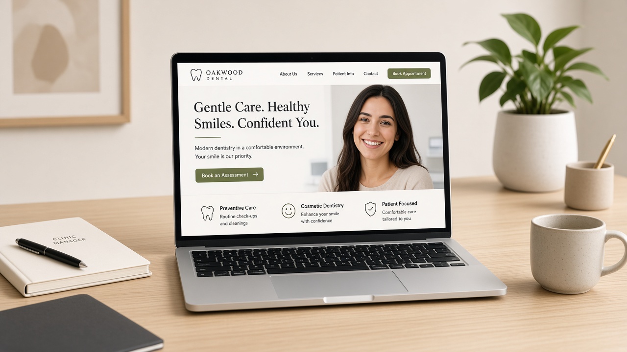
An Invisalign page should offer an aligner assessment or a TCO call, not “contact us”. An implant page should offer an implant assessment, with sedation and finance as supporting facts, not as equal headlines. If you also do dentures and bonding, those are other URLs. Mixing them so the menu looks complete is how a full-arch patient reads three contradictory prices and leaves.
Paid traffic should hit a variant that repeats the query in the first screen: the city, the treatment, the offer. Organic treatment pages can be longer. They still need the same first-screen decision: am I in the right place, and can I book.
Photograph of a real room or a real consult, not a stock kitchen island. A headline that names the treatment and the patient type. A subline that states what happens next: 30-minute assessment, CBCT if indicated, written plan. A single button. Trust marks that are specific: years placing implants, a named clinician, a genuine review that does not claim a miracle. Fees or a clear “plans from” if you can defend them.
Do not autoplay music. Do not hide the phone number. Do not make the only path a chatbot that asks “How can I help?” as if the page were not already about implants.
Three cases beat a wall of thirty. Each case should say what was done and that results vary. A short clinician film (talking, not a drone shot of the atrium) outperforms a second stock montage. If you are a provider for a brand aligner system, say so once. Do not build the page as an unofficial fan site. The patient is buying the practice.
Cost, pain, time off work, “I have been told I have no bone”, “I tried braces as a teenager”. Write the answers in plain English and link to the assessment, not to a PDF manifesto. Finance should be a calculator or a clear example, not a logo farm of lenders. Sedation should say who it is for. NHS patients looking for a private implant deserve an honest fork, not a bait paragraph.
If you have real TCO or assessment slots, put a short book beside the form. If you do not, the form should ask for the three things the TCO needs: name, phone, and a one-line clinical situation. Everything else can wait. Every extra field is a patient who will phone a competitor instead.
After submit, do not show a dead “thank you”. Tell them when they will hear, and give a number if that wait is longer than a working hour. The landing page’s job continues for sixty minutes after the click.
Some visitors want a date. Some want to know if they are even a candidate. A single button forces one of those groups to lie. Offer a primary action, book the assessment, and a secondary one that is still useful: “Ask the treatment coordinator a question” or a short suitability form. Do not offer a brochure download as the main goal. Brochures do not sit in chairs. If you use a quiz, keep it short and do not pretend it is a diagnosis. End on a human follow-up, not a score.
Aligner pages can talk about discreet treatment and time. They should also say who is not a candidate and that a dentist decides. Implant pages can talk about missing teeth and eating. They should also say bone, healing time and that a radiograph may change the plan. Honesty here is conversion for the right people. The wrong people were going to waste a consult anyway.
A landing page with four pixels, a heatmap, a chat, and a video background will miss the Core Web Vitals you needed for the quality score and the patient. Track the submit and the book. Do not track every scroll into oblivion at the cost of INP. If you run A/B tests, test the offer and the first screen, not the shade of a moss button for fourteen weeks. Stop tests that lose on mobile even if desktop “won”.
Write the confirmation as carefully as the hero. Name the next human. Give a time window. Repeat the clinic number. If you take a deposit, say what happens if they cancel, in the same tone as the rest of the site. Then make sure the TCO workflow you designed actually fires. A high-converting page that fills a queue nobody works is just a more efficient way to generate bad reviews.
Once a month, sit with the TCO and listen to five calls that came from the page. Change the page when the same objection appears three times. That loop, live conversation back into the URL, is the unglamorous version of CRO, and it beats another agency workshop about “the funnel”.
A beautiful associate bio does not convert an implant searcher. They can meet the clinician after they believe the pathway. Link the named dentist from the landing page, yes. Do not make the bio the landing page unless you are a single-handed brand and the person is the product. Even then, the first screen still has to offer the assessment. Ego pages rank for the dentist’s name. Treatment pages have to work for the patient’s problem.
If you run five sites, do not clone a London landing page into a market town and forget the parking. Local proof, local clinician, local photographs, same spine. Paid campaigns should land on the location variant. Shared testimonials from another city feel like a lie even when they are true. The template can be shared. The trust cannot.
Set a maximum length. If the page needs a second scroll of science, you probably wanted a supporting article linked as “read more”, not a landing page that forgot it was trying to book a slot. Keep the science. Move it. The assessment button should never be below a second essay on osseointegration.
A surprising number of UK clinics still treat Google Business Profile as a listing the agency “set up in 2019” and the website as a separate brochure. Patients do not experience them separately. They see the hours on Maps, tap the site, and decide whether you are the same organisation. When those two surfaces disagree, they believe Maps and they bounce.
Name, address, phone, opening hours, and whether you are accepting patients should be copied from one internal source of truth. If Wednesday closes at 14:00 for a study club, both places say so. Emergency wording should match. If the site says “private only” and the profile still says “NHS & private”, you will spend reception time arguing with the internet.
Categories matter. Primary category should be the thing you are. Secondary categories can carry implants or cosmetic, but stuffing every dental specialism is how you look generic and how Google gets confused about which query you deserve.
Link the profile to the page that helps that searcher. A group should not send every Maps pin to the corporate homepage if a location page exists. A squat that is not yet open should not send people to a “book now” that 404s. UTM-tag the website button if you want to see Maps as a source; then make sure the booking or enquiry on that landing page is the one you meant.
Reply to reviews in the same voice as the site, and do not invent clinical promises in a public reply. Photographs on the profile should be the building, the team and the rooms patients will actually walk into. Not a stock atrium in another country. If the website gallery is all chair-side macro and the profile is a dark shopfront from 2017, you have two brands.
GBP posts die quickly. Use them for true operational news: taking NHS lists, a Saturday implant clinic, a temporary closure. Put the lasting explanation on the website. The profile can point. It should not be where you hide the fees page you were too nervous to publish.
GBP lets you list services and even products. Use them to match the website’s actual menu. If you stopped offering NHS dentures, remove them. If you only place implants on one site in a group, do not let every pin advertise them. Inconsistency here is how you win the wrong click and lose an hour of reception time. The website service pages should use the same nouns. “Dental implants” on Maps and “tooth replacement solutions” on the site is how two algorithms decide you are vague.
Turn off messaging if nobody owns it. An unread Google message is a public record of neglect. If you leave it on, the same SLA as the website form applies: same working day, tagged, in the CRM. The Q&A section will attract competitors and patients with clinical questions you should not answer in public. Seed a few operational answers yourself (parking, new patients, emergency) and report the rest.
When you post a photo of the new chair, add it to the website too, or do not bother. The point is one practice, two doors. If the doors disagree, patients will pick the one that looks more recently inhabited, and that is usually Maps.
Google will offer to take bookings. If that button does not hit the same diary as the website, turn it off or configure it properly. Two books are worse than a phone number. Patients will use whichever UI appeared first and you will spend a morning reconciling. The website and the profile should share one booking brain, even if one of them only deep-links into it.
The same is true of the phone number. A tracking number is fine if it always rings the practice and if you still publish a stable number a human can remember. A tracking number that dies when the ads account pauses is how emergency callers reach a dead tone. Put the real number on the site. Use tracking where you can afford the failure.
Assign an owner. Not “the agency”. A named person in the practice who can change hours on a snow day before the website person wakes up. Give them login, 2FA and a two-line checklist: hours, holiday close, a photo of the door. The website can follow later the same day. Maps is the door patients believe when the weather turns.
Cosmetic pages are where dental websites go to get into trouble. The photographs are the product. The adjectives are the risk. Guidance from the General Dental Council on advertising, and the broader duty not to mislead, does not ban before-and-after images. It does ban the way many clinics still write as if a veneer were a personality upgrade with a guaranteed outcome.
This is a working note for principals and the people who edit their sites. It is not legal advice. It is the pattern of mistakes we see when a ranking or a paid campaign suddenly puts an old page in front of a new audience.

Avoid superlatives you cannot defend: “best smile in Manchester”, “pain-free always”, “guaranteed Invisalign in six months”. Avoid implying a celebrity result. Be precise about what the treatment is, who it may not suit, and that an assessment decides suitability. Fees, if you publish them, should be honest about “from” and about what the figure excludes. Scans, sedation, laboratory, review visits.
Testimonials need to be genuine, permissioned and not cherry-picked to invent a clinical claim the dentist would not write themselves. Five-star widgets are not a substitute for that judgement. If a review makes a medicinal claim, it should not be the hero sentence on the implant page.
Use real patients who have given specific consent for website and ads, not a blanket “we may use photographs”. Keep lighting, crop and expression comparable so you are not selling a better camera. Label the treatment actually provided. Do not retouch teeth. Do not use stock dentistry grins next to a “our patients” caption. If you would be uncomfortable explaining the image to a complainant, it is not ready.
A short caption beats a moodboard: treatment, timeframe, that individual results vary. If the case needed restorative work as well as aligners, say so. The lie by omission is the one that travels.
Identifiable patients are not decoration. Minors need a higher bar; in practice, do not use children’s faces for marketing unless you have a specific, documented reason and consent that would survive scrutiny. Staff photographs are simpler but still need consent if you are running them in ads. The “team” page is not a loophole for a Meta campaign.
One clinician signs off treatment pages. The TCO does not publish a new gallery on a Friday because the photographer delivered files. Keep a register of consents against URLs. When a patient withdraws, the image has to be removable from the site, the ads manager and the CDN, not just “the next web update”. That last part is where practices discover they never owned the folder.
If you run NHS and private on one domain, keep the promises from crossing. A private bonding gallery that sits above an NHS “register” form will be read as one offer. The GDC cares about what a reasonable person takes away, not what your designer grouped in Figma.
A compliant website can still become a non-compliant ad. The Meta crop that drops your caption, the Google RSA that invents “best dentist”, the before image used as a scare thumbnail. Those are your problem when someone complains. Keep a folder of approved headlines. Ban “celebrity smile” language in the ads account, not only on WordPress. If an agency runs the account, put the GDC advertising guidance in the contract and require written approval for new creative that uses clinical photographs.
Landing pages built only for paid traffic need the same consent trail as the main site. “It’s just a funnel” is not a category the GDC recognises. If the photograph is on the internet with your name under it, it is advertising.
Publishing fees is good manners and good conversion. Publishing them badly is a claim. “Implants from £X” must be a price a real patient can still encounter after assessment, not a loss-leader that only exists if they need nothing else. Finance examples should say representative and name the lender. If you do not offer 0%, do not let an old banner say you do. Mixed practices must not let an NHS patient read a private fee as a band charge, or the reverse.
Once a quarter, a clinician reads the implant, aligner, bonding and homepage out loud. Anything they would not say in the chair gets cut. Check the gallery consents. Check the team page for people who have left. Check the blog for a guest post that made a whitening claim you no longer stand behind. This takes an hour and prevents the five-year-old paragraph that only surfaces when a journalist or a complainant searches your name.
Keep a changelog. When you alter a claim, date it. If you ever need to show what the site said, a memory of “we were always careful” will not do. The internet remembers the old screenshot even when you do not.
Use the titles people are allowed to use. Do not let a copywriter promote someone to a specialist implied by the GDC specialist lists if they are not on them. “Special interest” is not a loophole for a headline. Link GDC numbers. If a clinician leaves, the treatment page that still quotes them as “our implant lead” becomes a complaint waiting for a screenshot. This is copy maintenance, not a rebrand.
Private patients do not wait for a 4MB hero video of a slow-motion smile. They are on a phone, often on the practice Wi-Fi they do not yet have, comparing two clinics before a school run. Core Web Vitals are the least romantic part of a dental website and one of the few that correlates with a form actually submitting.
Homepage scores are a vanity metric in this sector. The money pages are Invisalign, implants, emergency, fees and the location page a Maps user hit. Run Lighthouse and, more importantly, CrUX field data on those URLs. A lab-only green circle on a cached desktop homepage is how agencies hide a 6-second mobile LCP on the implant gallery.
Uncompressed before-and-after carousels. Autoplaying hero video. Three chat widgets. A review plugin that pulls the entire Google dump on first paint. A booking iframe that shifts the page when it wakes up. Cookie banners that steal the first tap. None of this is mysterious. It is a stack of “just one more” decisions.
Fix images first: modern formats, real dimensions, lazy-load everything below the first screen, and stop using a 3,000-pixel smile as a CSS background. Then kill the second chat vendor. Then make the booking embed reserve its height so the Book button does not jump.
Interaction to Next Paint is the delay after tap. On dental sites it shows up as “the form froze” and a patient who rang instead, or did not. Heavy page builders, unused animation libraries and third-party review popups are the usual cause. If a field takes half a second to focus, you will see it in abandoned forms before you see it in Search Console.
Good field LCP on mobile for a treatment page. No layout jump on the cookie or booking modules. A form that accepts input immediately. You do not need a 100. You need a page that a parent can use one-handed outside school. That is the brief to give the developer, and it is more useful than “make it faster”.
Give them the five URLs that make money and the mobile CrUX numbers on each. Ask for a cap on third-party scripts and a budget for LCP image weight. Ask them to reserve space for the cookie banner, the booking embed and the review stars so CLS is not a surprise. If they work in a page builder, agree which blocks are banned on treatment pages: sliders, counters, background video, “just one more” animation.
Then agree a re-test after every plugin update. Dental sites go yellow again the week someone installs a new chat. Put the re-test in the retainer so it is not a favour. If the agency cannot talk about field data, they are decorating, not maintaining.
A slow origin will beat a beautiful image pipeline. If Time to First Byte is poor, fix hosting before you argue about WebP. If the booking iframe is served from a distant region, the page will feel broken even when Lighthouse is polite. Measure the embed separately. Patients do not care which vendor caused the spinner. They care that the next clinic’s button worked.
Photography still matters. Compress it. Do not delete it. A fast page of stock offices will lose to a slightly heavier page of your actual rooms. The job is to keep the real rooms and lose the junk around them.
If you only have an hour with a developer, do this in order. Replace the homepage and treatment hero with a correctly sized image. Lazy-load the gallery. Remove the second review widget. Give the booking embed a min-height. Stop the chat from loading on mobile until tap. Defer the analytics that are not the one conversion pixel you trust. Re-test the implant URL on a mid-range Android. That hour usually recovers more bookings than a brand refresh of the same cost.
Write the new baseline down. Next month you will need it, when someone adds a popup and swears it is light.
Share the monthly field report with the principal in one slide: the five URLs, mobile LCP, and whether a form was abandoned. If they can see the implant page losing a second, they will approve the next cull of widgets. If they only hear “Google likes speed”, they will approve another video. Make the vital signs as concrete as a broken autoclave: a number, a page, a patient action that did not happen.
Practices hire a treatment coordinator and then leave them to “follow up the website leads”. That sentence is how high-ticket dentistry leaks. The TCO role only works when the enquiry, the first conversation, the assessment book and the no-show rescue are a written workflow. The same way a nurse has a tray set-up, not a vibe.
This is not a sales-training piece. It is the operational path a private or mixed UK site needs if implant, aligner and smile-makeover pages are going to earn their photography.
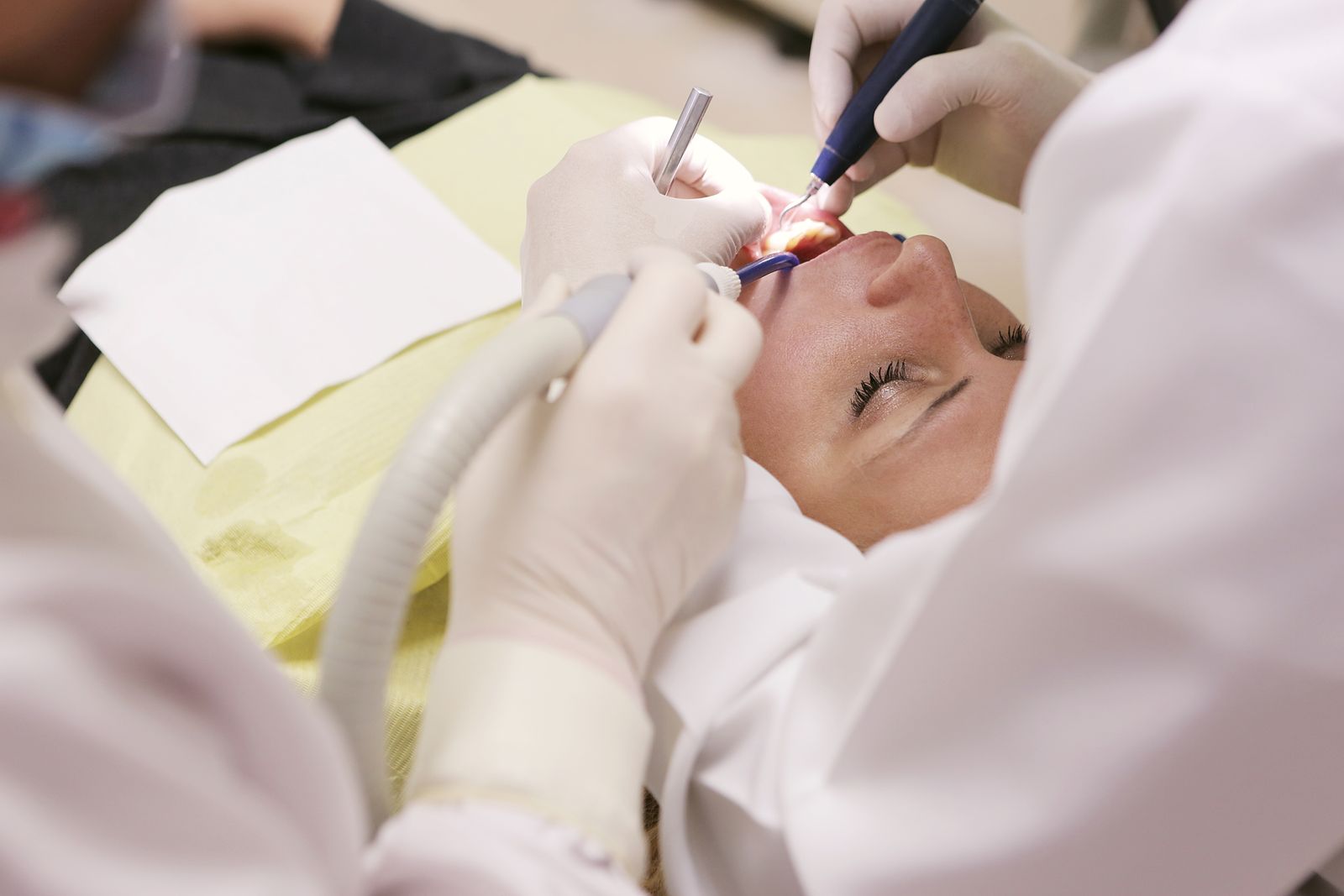
Every inbound (form, chat, phone, Instagram) should land in one queue the TCO can see on a phone. If reception “mentions it when they can”, you have already lost the patients who submitted at 21:40 after reading reviews in bed. Speed-to-lead in private dentistry is not a growth-hacker slogan. It is the difference between a consult and a competitor who answered.
Tag the treatment before anyone speaks. An implant enquiry and a child NHS enquiry are not the same ticket. The first message can then be specific: “I can see you asked about a full-arch assessment” is a different human event from “Thanks for your enquiry”.
The TCO is not there to quote a fee on a missing tooth they have not seen. They are there to establish fit, anxiety, timescale, and whether the next step is a clinical assessment, a remote triage, or an honest redirect. Write the questions down. “Have you already had a CBCT?” is a better opener than “How did you hear about us?”, though you should still capture source.
Offer a slot in that call or that thread. “I will get someone to call you” is how diaries stay empty. If the surgeon’s book is tight, sell the TCO or dentist assessment you actually have, not a fictional next-Thursday with the implant lead.
Most “lost” implant patients are not lost. They are waiting for a partner, a fee, or courage. A humane sequence is a same-day note, a day-two value email (what the assessment includes, what it does not), and a day-five SMS that is allowed to be short. After that, a 30-day check-in. Stop dressing this up as a 14-step nurture funnel. Nobody in pain wants a newsletter about enamel.
Record the reason they paused. Finance, fear, “seeing another clinic”, and “not ready” need different later messages. A CRM that only has Won/Lost is why TCOs keep personal notes in WhatsApp.
The assessment dentist should be able to open the record and see the photographs the patient already sent, the questions they asked about sedation, and the fee band you discussed. If that context lives in the TCO’s head, the patient has to perform their anxiety twice. That is how they choose the clinic that felt like it had been listening.
After the consult, the TCO owns the plan presentation, the finance paperwork and the cooling-off questions. The dentist owns the clinical recommendation. When those roles blur, patients get two different numbers and a complaint about “pressure”.
Do not start with “conversion rate”. Start with time-to-first-human, percentage of enquiries that received a slot offer, and percentage of assessments that had a complete record. Those three move first. The revenue number follows them, and it is less likely to be gamed.
Write the first thirty seconds, not a novella. Name, treatment they asked about, whether they have seen a dentist in the last year, and a slot. Allow the TCO to go off-book when someone is upset or in pain. The script exists so a new hire does not invent a fee. It does not exist to turn a frightened patient into a call-centre statistic. Record a few real calls, with consent, and use them in training. The gap between the laminated sheet and the actual conversation is where most “our TCO is not converting” stories actually live.
Give the TCO permission to say no. A patient who wants a same-week full-arch at a price you do not offer is not a lead to be squeezed. A clean redirect, or an honest waitlist, protects the brand more than a forced consult that becomes a one-star story about pressure.
If the website books a TCO video call, send the join link that works on a phone, and a calendar file. If they are coming in, send parking, entrance, and what to bring. A surprising number of “no-shows” are people who could not find the door or thought they needed a referral letter. The workflow includes the building. Put the same facts on the confirmation page the booking tool generates. If that template cannot be edited, change tool or write a parallel email you control.
Do not hide fees until the consult if your market is comparison-heavy and your competitors publish bands. Do not invent a precise full-arch number on a phone call from a selfie. Teach the TCO the difference. A published “assessments from” and a clear finance sentence will remove the patients who were only ever shopping a fantasy price. The ones who stay are easier to look after. Track how often money is the stated pause reason. If it is most of them, the website is lying about cost or the phone script is.
Close the loop after treatment starts. The TCO should know when the first aligner fit or the first surgical date is, because that is when anxious patients email again. A workflow that ends at “plan signed” is only half a job. The reviews you want are written after the journey felt held, not after the deposit cleared.
The workflow cannot be a person. Write the backup: who watches the queue on the TCO’s day off, what they are allowed to book, and what they must not quote. Put the same views on a practice-manager phone. If cover means “reception will mention it”, you will see it in Friday enquiries that go cold. Measure cover weeks separately so you do not blame the website for a staffing hole.
Keep a short library of approved answers for common implant and aligner questions, stored in the CRM, not in a forgotten Google Doc. When a locum uses an old fee, that is a process failure. Update the library when fees or clinicians change, the same week, the same way you would update a price list at the desk.
If a visiting implant surgeon sits once a fortnight, the TCO must book against that reality. The website should not offer “this week” if the book is a fortnight out. Show the constraint early. Patients prefer an honest date to a fictional soon. After the surgical day, the TCO still owns the review booking and the questions that arrive at 21:00. Visiting clinicians leave. The practice brand stays, and so does the inbox.
Most dental websites still treat booking as a costume. The button is large. The form asks for a name, a phone number and a vague “reason for visit”. Someone in reception copies that email into the PMS when they have a minute. The patient, who thought they had booked, is still waiting for a call.
An integration is a different object. The site offers real availability, or at least a constrained request that lands as a task against a live chart. The PMS remains the diary. The website is the front door that already knows which chair, which clinician and which appointment type you are willing to give a stranger.
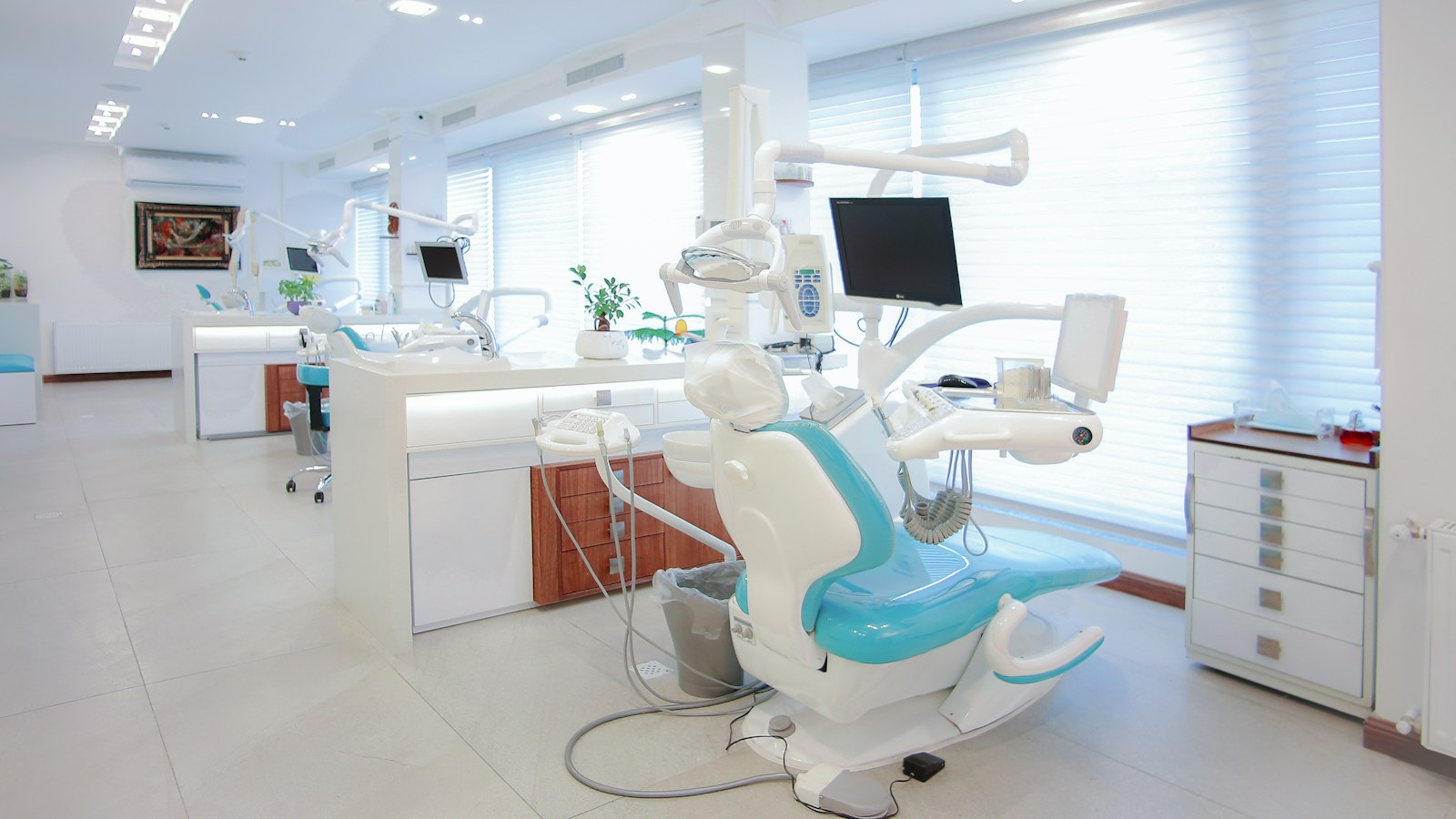
Level one is notification: a form posts to email or a Slack channel. It is better than a mailto link and it is not a booking system. Level two is a lead in the CRM or PMS with a treatment tag. Useful, still not a slot. Level three is diary-aware booking (Dentally, SOE, Carestack, or a specialist layer such as a true online book) where the patient can take a new-patient exam, an emergency slot or a hygiene visit you have chosen to expose.
Private implant and Invisalign journeys often should not be level three on the first click. Those patients need a TCO conversation before they occupy a surgeon’s hour. The website can still be integrated: the form creates the person, tags the treatment, and offers the TCO diary rather than the surgeon diary.
Do not put the whole book online. Expose the appointment types that a stranger can safely take: new patient private, emergency, hygiene if you want it, a short implant assessment. Hide the clinician’s restorative blocks, the NHS sessions you cannot fill from the internet, and anything that needs a medical-history gate you have not built yet.
Map each treatment page to one destination. The Invisalign page should not share a form with “contact us”. If the PMS cannot tag the source, the agency can still pass a hidden field. The failure mode is one inbox and a receptionist guessing.
Double books happen when the website cache and the PMS cache disagree. “Booked” emails that never created a chart happen when the middleware user lost permission after a password rotation. Duplicate patients happen when the matcher is email-only and the patient used a second address. GDPR awkwardness happens when the booking vendor stores the medical questionnaire in a US region nobody named in the privacy notice.
Test with a real dummy patient every time the site, the theme or the PMS updates. If only the developer can run the test, the integration will rot.
Website collects intent and consent. Booking layer offers allowed slots. PMS is the system of record. CRM, if you have one, watches the same person rather than inventing a second one. The treatment coordinator lives in that chain, not in a personal Gmail label called “website leads”.
Decide, in writing, whether the website may offer an emergency slot and what that slot is. A true emergency book that lands on a nurse-led triage call is different from a stranger taking a restorative hour because the widget showed “next available”. If you close the online emergency type at 18:00, say so on the page. Patients who find a 404 at 22:00 will still phone; they will also leave a review about the button that lied.
Give the out-of-hours path a human sentence: the number, the service you use, and what not to wait for. That block belongs on the booking confirmation as well as the contact page. Integrations fail at the edges of the week, not at Tuesday 11:00 when everyone is in the building.
If the booking tool asks about pregnancy, bleeding, or medication, you have moved from diary logistics into health-adjacent data. Your privacy notice has to name that vendor. Your DPIA, if you have one, has to mention it. Do not collect a medical questionnaire on the website “to save time” if the PMS already has a safer place for it on the day. Collect the minimum that lets you book the right appointment type. Everything else can wait for the waiting room tablet you already pay for.
On the first Monday, submit one dummy new-patient book, one dummy treatment-form, and one failed payment if you take deposits. Confirm the chart, the tag, the confirmation SMS and the cancellation path. Log it. When the drill fails you will be glad it failed on a dummy named Test Patient and not on a full-arch enquiry you cannot find. This is unglamorous. It is also the entire difference between “we are integrated” and “we were integrated in the demo”.
Keep a simple architecture diagram: site, form plugin, booking vendor, PMS, SMS, CRM. When someone wants to add a chat tool, make them draw the new box. Most dental websites rot because nobody was allowed to say the stack was already full.
If you take a deposit online, the PMS must show that money against the person, not against a ghost booking. If finance is applied for between the website and the assessment, the TCO needs the status without phoning the lender as a hobby. These are the integrations practices skip because the demo booked a hygiene visit. High-ticket dentistry fails in the middle of the journey, where money and medical reality arrive together.
Write the failure email. When a payment does not clear, the patient should get a sentence that is not “error”. When a slot is taken during checkout, they should get the next two options, not a dead end. Someone has to own those templates. If the vendor will not let you edit them, that is a reason to leave the vendor.
A dental CRM is not a nicer contacts list. It is the place enquiry, medical history, treatment-plan value and the next booked minute either meet or get lost. UK principals usually shop the logos first (Dentally, Software of Excellence, Carestack, plus a handful of PMS-adjacent tools) and only later notice that the website, the phone and the treatment coordinator are still living in three different inboxes.
This is a buyer’s note, not a vendor review. None of those products is “the best CRM for dentists” in the abstract. The fit depends on whether you are a single private site with a busy TCO, a mixed NHS book that still takes new patients by phone, or a group that needs location-level reporting without inventing a second database.

In a practice the CRM has four jobs. It has to catch the enquiry (web form, chat, phone note, Instagram DM) without making someone retype it. It has to show the next human action: call back, send the implant pack, book the TCO. It has to sit next to the clinical record so you are not copy-pasting medical alerts into a marketing tool. And it has to tell you, without a Friday spreadsheet, which campaigns and which treatment pages produced a consult that actually sat down.
If a product only does email campaigns and a pipeline board, it is a marketing CRM wearing dental clothing. That can still be useful. It is not a replacement for the patient record, and it should not be sold to you as one.
Dentally is often in the room because it is cloud-native and the front-of-house screens feel modern. Software of Excellence is in the room because a large share of UK sites already live there, and moving a decade of charts is a political act as much as a technical one. Carestack arrives in conversations about groups, US-style ops discipline and a single database across sites. Around them sit PMS tools with CRM modules bolted on, and generic platforms (HubSpot, HighLevel, a spreadsheet with ambition), that a marketing agency already knows how to drive.
High-level, the split is this. A dental-native system will understand providers, chairs, NHS/private mix and recall cycles. A generic CRM will understand lead scoring and email sequences and will fight you on clinical vocabulary. A bolted-on PMS module will understand the patient and will often be clumsy at the marketing edge. None of that is a moral judgement. It is a map of where the pain will land.
Ask where a website enquiry lands in the first sixty seconds, and who sees it if reception is with a patient. Ask whether the TCO can see the same record the dentist will open on assessment day. Ask how failed appointments, finance applications and “think about it” outcomes are coded, because those three states are where private value goes to sleep. Ask what happens to the record if the patient already exists. Duplicate charts are how practices lose the medical history they were sure they had.
Then ask the unfashionable questions. Who hosts the data, and in which country. How you export if you leave. Whether the vendor’s “AI notes” write into the clinical record or into a side car you cannot defend at a complaint. Whether NHS claim and private plan logic can live on one patient without the front-of-house inventing a workaround.
The most expensive CRM in the building is the one that never sees the Invisalign form. If your agency built a beautiful treatment page that emails a generic inbox, the CRM is decoration. The integration test is boring and decisive: submit a dummy implant enquiry from the live site, watch it appear with UTM source, treatment tag and a task, and time the first human response. If that path needs a Zapier recipe that only one freelancer understands, you do not have an integration. You have a hobby.
The same is true in reverse. A CRM that cannot deep-link to an online book (or at least to a real diary slot) trains the team to keep using the phone. Patients will still call. The point is that the record of the call and the record of the web lead should not be different species.
Write down the three journeys that make you money: new private consult, existing-patient upgrade, and recall that should have been a hygiene book. Score each vendor on those journeys with the people who will live in the software, not the people who signed the demo. Keep the clinical system of record where it is unless you have a genuine reason to migrate. Buy the CRM that makes those three journeys quieter.
If two products tie, pick the one your treatment coordinator will actually open on a Monday morning. Unused pipeline stages are not a strategy. They are clutter with a monthly invoice.
A one-surgery private practice can live with a lighter CRM if the TCO is disciplined. The risk is personality-driven software: the system works because one person remembers the exceptions. When that person is on leave, implant enquiries go into a personal inbox and come back as complaints about “nobody called”. If you are a single site, buy the product your TCO will open, and write the workflow down so a locum receptionist can follow it on a Tuesday.
A group has the opposite problem. You need location-level pipelines without inventing ten different stage names. You need to see which site is sitting on “think about it” implant plans, and you need a head-office view that does not require exporting CSV files into a weekend. This is where Carestack-style platforms and serious SOE estates earn the meeting, and where a generic marketing CRM starts to look like a second job. Do not let a group demo sell you features a single site will never staff.
Ask for a written plan for open treatment plans, recall lists, medical alerts and marketing consents. “We will import your patients” is not a plan. Who maps the duplicate Johns Smiths. What happens to historical SMS opt-outs. Whether old plans remain read-only. How long you run dual systems. A two-week overlap costs money and saves the week you discover hygiene recalls never crossed.
If you are staying on your current PMS and adding a CRM beside it, the migration is smaller and the integration is the project. Budget the integration as a first-class line, not a “we’ll Zapier it”. Name the person who owns the mapping after the agency has gone.
Insist on role-based training: reception, TCO, principal, not a single webinar for “the team”. Ask for a one-page cheat sheet per role. If the vendor cannot explain how a failed-to-book implant enquiry is coded, the software will be used as an address book. Review usage at week two and week six. Empty custom fields are a smell. So is a principal who only logs in to look at a dashboard the TCO padded.
Finally, write the exit. Export format, image attachments, open tasks. A CRM you cannot leave is not a clinical partner. It is a hostage arrangement with nicer charts. The UK market will keep rotating products. Your patient list should not be trapped in the one you happened to demo in 2026.
Ask to see the default reports with dummy data from a practice like yours, not a polished American group. You want new enquiries by treatment, time to first response, assessments booked, plans presented, plans started, and revenue that can be tied to a source without a side spreadsheet. If the only impressive screen is a world map of logins, you are buying theatre. If the report cannot split NHS and private, mixed sites will lie to themselves within a month.
Agree who reviews the numbers and when. A Monday TCO huddle with three figures beats a quarterly PDF nobody opens. The CRM is working when those three figures change how you staff the week. It is not working when it produces a dashboard for a principal who already knows the week was quiet.